SOFT SURFACE
HARD SURFACE
APPLIED SURFACES
To truly study the transformative nature of color, we brought it back to the basics. We collected and coordinated found items big and small, artful and ordinary. An egg. A honeycomb. An old cell phone. Even a container of pink eraser shavings. We put them together with swatches and samples, studying how the color evolved organically and graphically. Looking at color through the lens of found objects, we saw something in the unexpected. Here are our palettes of the moment.
Moody and wistful with colors both comforting and charmed. Mossy greens in a fabled forest, botanical hues shift and fade for a trove of soothing color.
A lively mix of punchy blues, bold and bright. For boisterous moments and energetic spaces, turn up the color for design that’s in the mix.
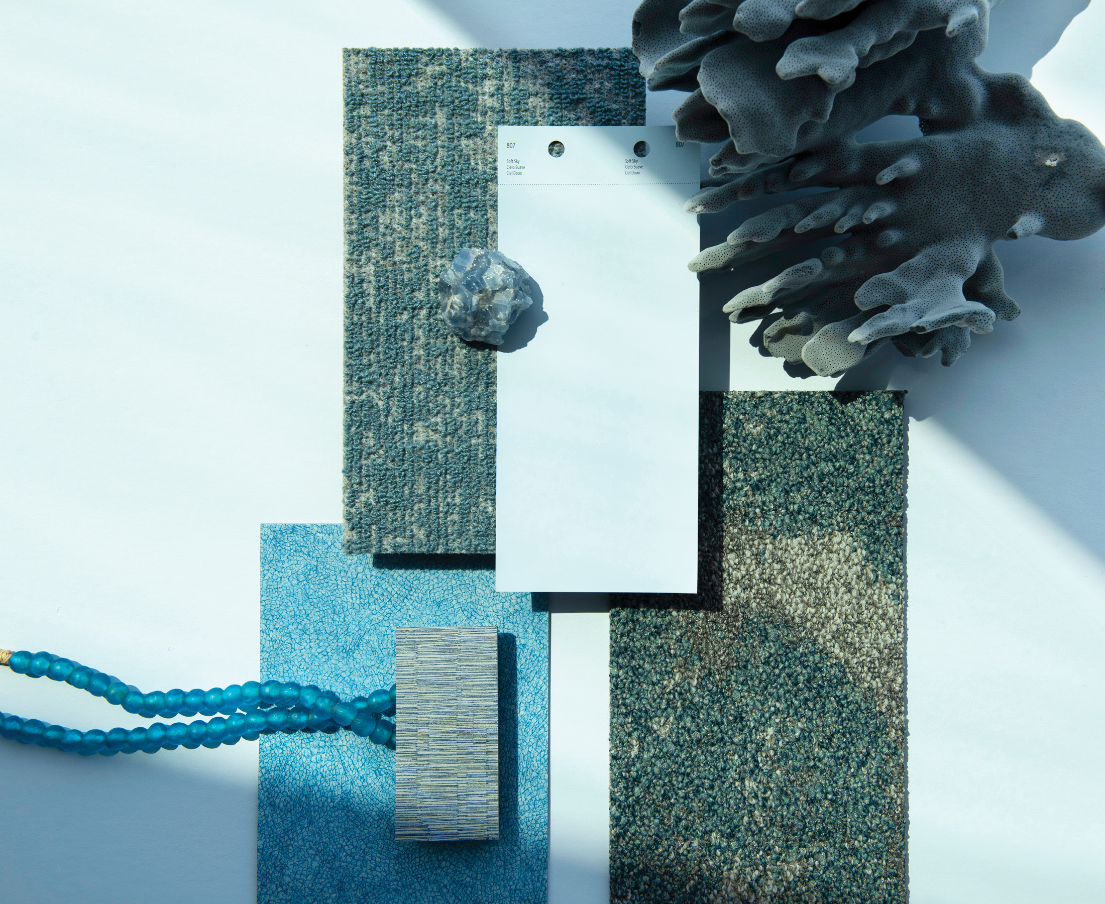
Seafoam and misty hues coalesce with mystical allure. Awashed in tonal blues to create a sense of calm. Soothing and subtle. Gentle and sublime.
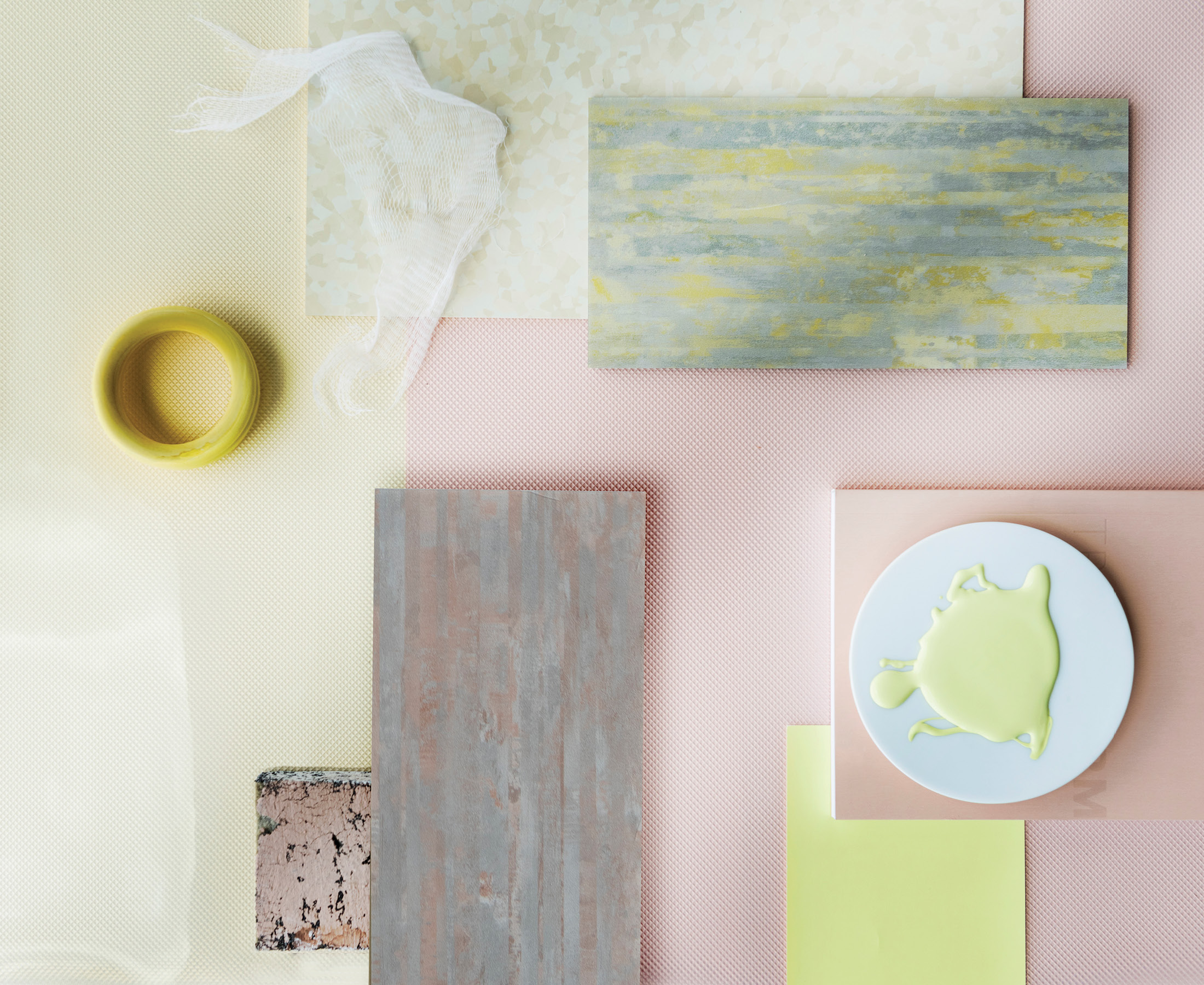
Hey there, sunshine, color is here to play. Frosty lemon, ballet pink and shades of sunny days, spirited and fresh. Nostalgic moments in whimsical spaces.
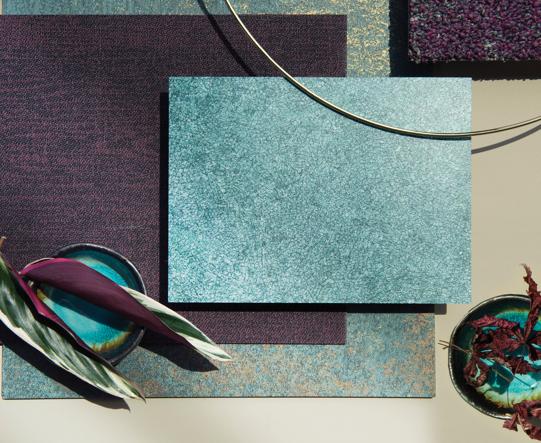
Jewel-toned hues, abundant and rich for contrast and connection. Subtle hints of shimmer add radiance and luster, complementing a saturated gemstone palette.
The warmth of bright hues. The comfort of soothing textures energizes and illuminates for positive impact, enhancing connectivity. Emotive and joyful. Curated to enliven the spaces that surround us. We bask in its comforting glow.
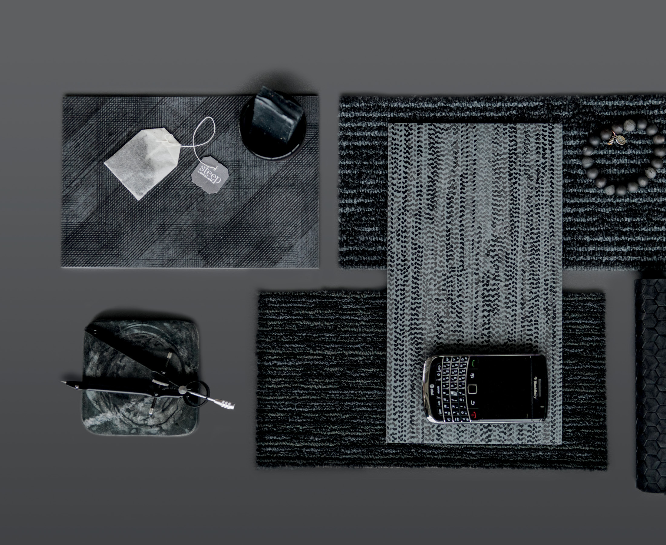
Saturated carbon. Ultra-rich charcoal. Texture softens the palette. Explore the duality of contrast. What’s old is new. Take a look back to design forward.
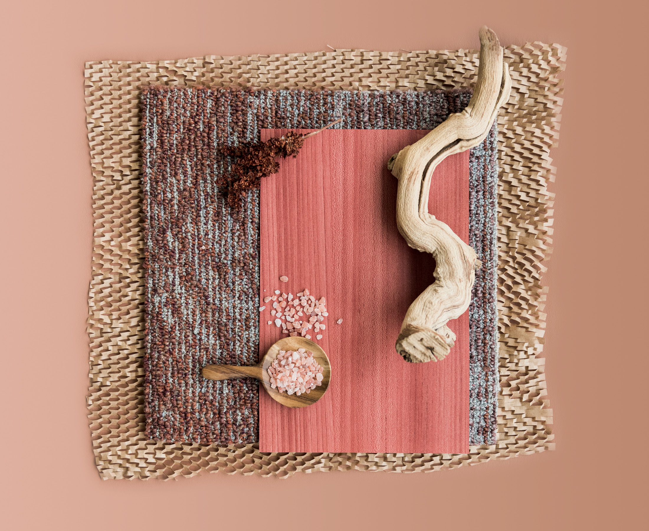
Sunset laden hues. Shades of sunbaked terracotta. Warm shades. Peaceful vibes. Earthly desert tones create textures rooted in organic elements.
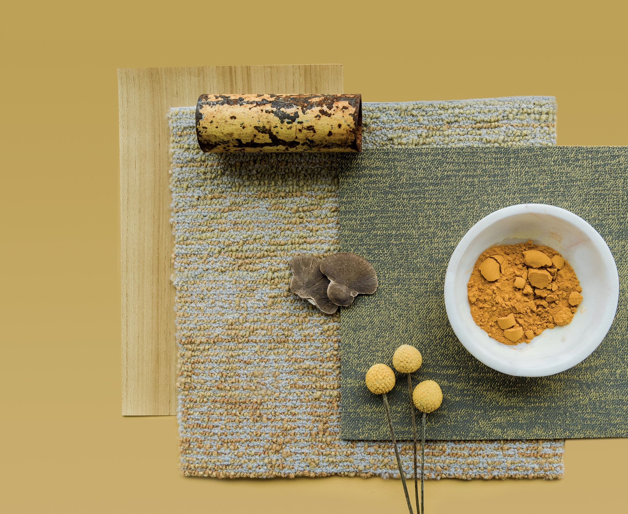
Saturated pigments in ocher and gamboge merge with muted tones in ecru and sand. Biophilic. Adaptogenic. Nurture mindfulness. Enhance wellbeing.
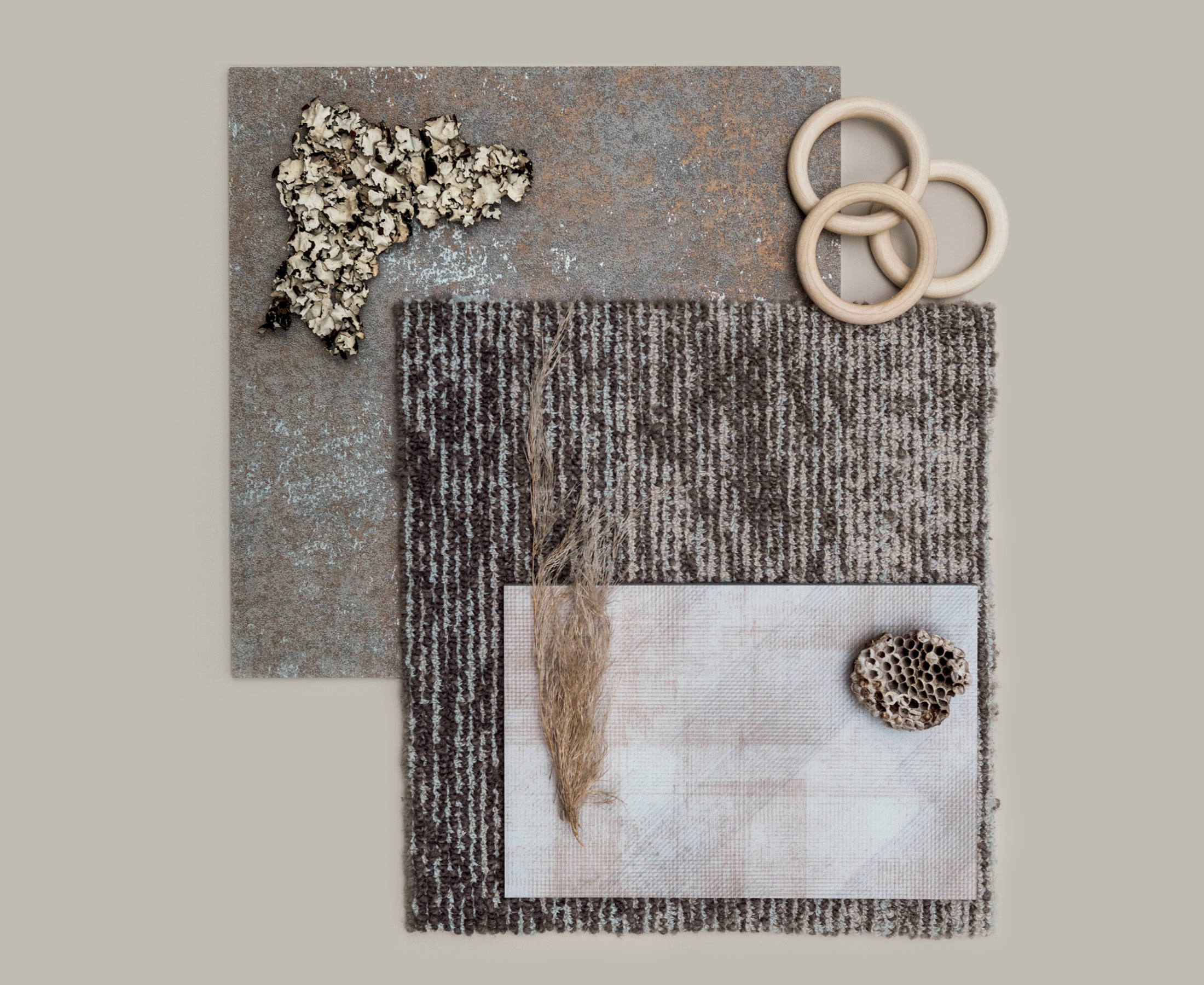
Soft tonal shades. Soothing neutral hues. Create a textural calm. Present. Familiar. Thoughtful. Embrace the feeling of being adrift. Let’s get carried away.
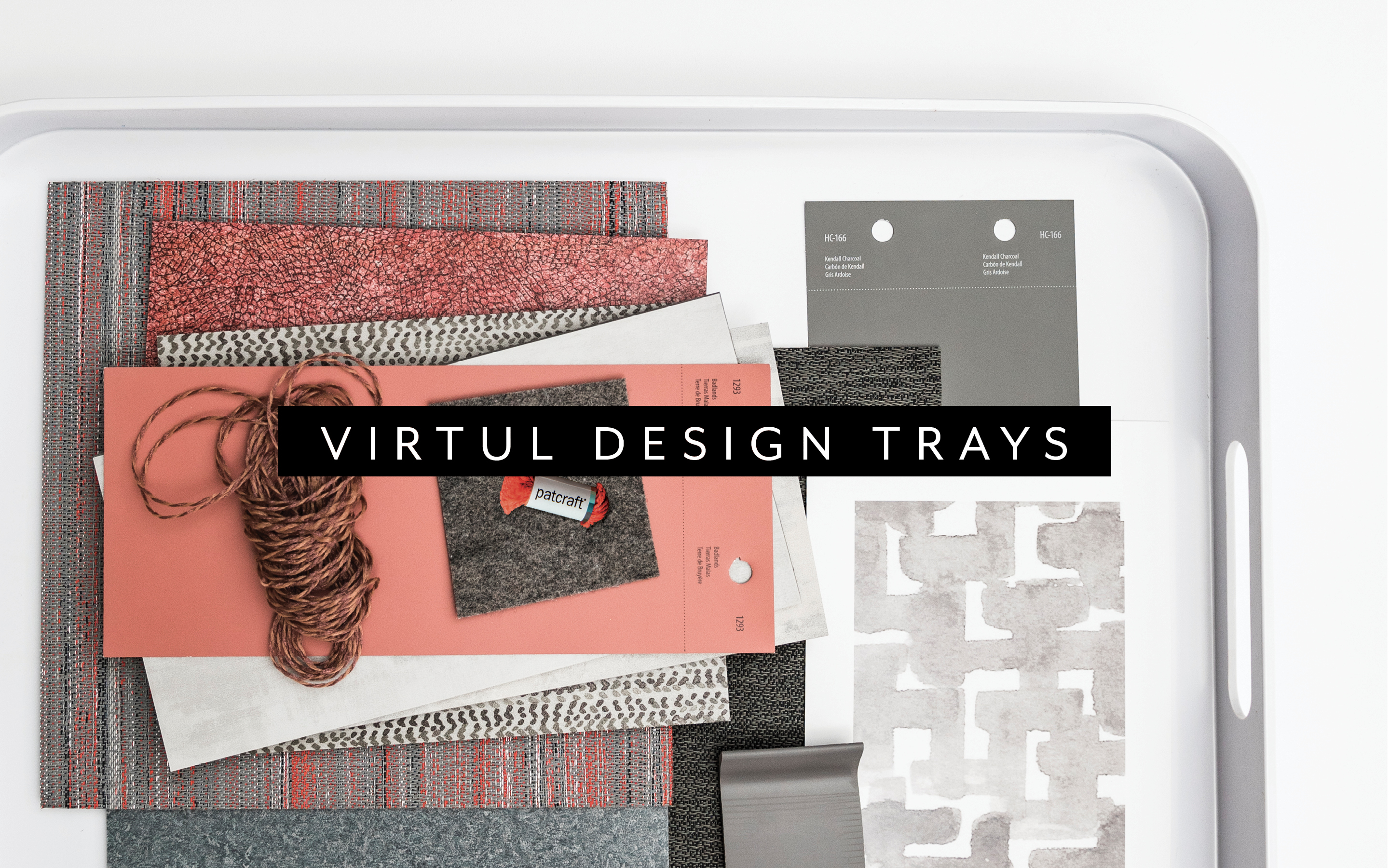
Create coordinated palettes, order flooring samples and select 4 x 8 paint swatches through our Virtual Design Tray Tool. Coordinated paint swatches and curated product samples. Design squared.
Create your tray